In today’s world, data is everywhere—from the steps we take on our fitness trackers to the metrics business leaders monitor when making strategic decisions. But raw data alone doesn’t drive insights. It’s the ability to see patterns, relationships, and trends in that data that truly makes it valuable. That’s where data visualization comes in. Data visualization bridges the gap between information and understanding, transforming complex data into intuitive visual formats like charts, dashboards, and interactive diagrams.
To understand how data visualization works, you need to look at the full process: gathering data, shaping it, selecting the right visual models, applying design principles, and interpreting results to inform decisions. This guide walks through each step, explaining the techniques, tools, and thinking behind powerful visual storytelling with data.
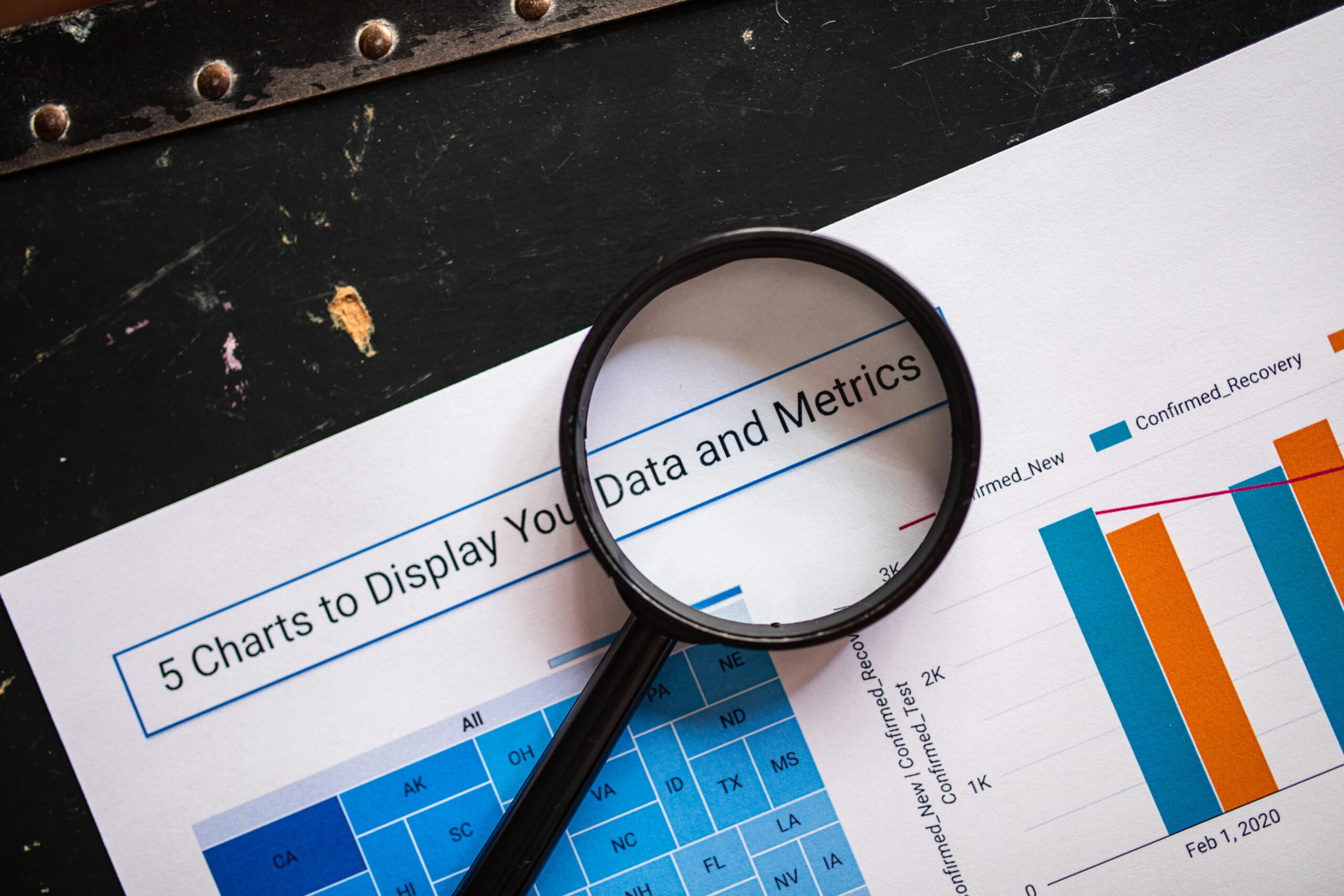
What Is Data Visualization?
Data visualization is the practice of turning numeric or categorical data into visual representations. It helps people make sense of information quickly and clearly by translating data into shapes, colors, and spatial relationships our brains can interpret efficiently.
Rather than scrolling through spreadsheets or reading dense reports, viewers get instant insight into trends, outliers, and relationships. Strong visualizations take complex information and communicate it accessibly—reducing cognitive load and increasing clarity.
But visual charts don’t appear magically from raw data. Data visualization is a pipeline—a structured process that transforms information from raw input to visual insight.
Step 1: Collecting and Preparing Data
Effective data visualization starts with reliable data. This phase is often called data collection and preparation, and it involves gathering information from different sources and making it usable.
Data Collection
Data can come from many places, including:
- Spreadsheets
- Databases
- Analytics platforms
- APIs
- Surveys
- CRM tools
- IoT devices and sensors
The quality of the input determines the usefulness of the output. Inaccurate or incomplete data will produce misleading visuals, so a key goal early on is verifying accuracy.
Data Cleaning and Structuring
Once collected, data rarely comes perfectly formatted. Analysts typically:
- Remove duplicates
- Handle missing values
- Fix inconsistent formats (e.g., dates, currency)
- Standardize categories and labels
- Filter irrelevant records
This process, sometimes called data wrangling, ensures the dataset is tidy and trustworthy. Clean data produces cleaner visual insights.
Step 2: Selecting the Right Visualization Type
Every dataset has a story to tell—but each story requires the right visual language. During this stage, you match the goal of the analysis to the visual form that best expresses it.
Common Visualization Goals
- Compare values (bar charts, grouped columns)
- Show change over time (line graphs, timelines)
- Illustrate distribution (histograms, box plots)
- Reveal relationships (scatter plots, bubble charts)
- Show proportions (pie charts, stacked bar charts)
- Map geospatial patterns (heat maps, choropleth maps)
Using the wrong chart—like a pie chart for dozens of categories or a line graph for unrelated variables—can mislead viewers. Great visualization starts with strategic selection.
Step 3: Applying Visual Encoding
Visual encoding is how you convert data into visual elements. You assign meaning to shapes, colors, lines, and positions so the viewer can decode information instantly.
Core Encodings Used in Visualization
- Position – where a data point sits on a graph
- Length / Size – the height of a bar or size of a bubble
- Color – values grouped or highlighted by hue
- Shape – distinguishing categories or variables
- Lines – connecting values to show movement or change
These choices determine how quickly someone can interpret a chart. For example, bar length and axis position are easier for the brain to quantify than color shade alone—meaning a bar chart is usually better than a color legend for comparing numbers.
Color and Clarity Matter
Color is powerful but must be used intentionally:
- Warm colors (red, orange) draw focus
- Cool colors (blue, green) create background context
- Colorblind-friendly palettes ensure accessibility
Thoughtful encoding turns data into meaning rather than noise.
Step 4: Designing for Communication
Data visualization is as much about design as it is about analysis. An elegant chart can still fail if it’s cluttered, confusing, or overwhelming. Communication-driven design means prioritizing clarity and usability.
Key Design Principles
- Keep charts simple – remove distracting gridlines, shadows, and effects
- Use intuitive scales and labels – always label axes and units
- Avoid chart junk – only show what adds meaning
- Highlight the most important values – bold lines, contrasting colors, or annotations
- Use consistent formatting – same colors and fonts across a dashboard
The goal isn’t decoration—it’s comprehension. A clean, minimal visual communicates more effectively than a flashy one.
Step 5: Building the Visualization With Tools
Once your structure and design plan is ready, you create the visual. Different visualization tools exist for beginners, analysts, and developers.
Automation and Dashboards
Modern BI platforms automate refreshing and updating data. Dashboards allow:
- Live KPI tracking
- Drill-down insights
- Filters and interaction
- Real-time changes
When organizations need ongoing insights—not one-time charts—dashboards offer a constantly updating window into performance.
Step 6: Interpreting and Presenting Insights
A visual is only useful if it drives action. After creating charts or dashboards, the next step is communicating the meaning behind them.
Turning Visuals Into Action
Analysts often:
- Present findings
- Provide recommendations
- Explain patterns and anomalies
- Answer stakeholder questions
- Suggest improvements based on insights
A key purpose of visualization is decision-making. Whether it’s marketing strategy, healthcare forecasting, or sports performance analysis, visuals help leaders take smarter, faster action.
How Interactivity Enhances Understanding
Static charts are helpful, but interactive visuals add depth. Filters, tooltips, zoom features, and drill-downs let users explore data on their own terms.
Common interactive features include:
- Hover-to-reveal values
- Selectable time ranges
- Drop-down filters
- Animated trend overviews
- Clickable map regions
This empowers people to investigate data rather than simply observe it.
Real-World Data Visualization Applications
Data visualization powers industries across the globe. A few examples:
Healthcare
- Monitoring patient health trends
- Visualizing disease outbreaks
- Tracking hospital performance metrics
Finance
- Portfolio performance dashboards
- Risk heat maps
- Real-time trading visualizations
Marketing & Sales
- Funnel performance charts
- Customer segmentation heat maps
- Ad campaign dashboards
Government & Policy
- Census and demographic mapping
- Public health tracking
- Budget visualization
From everyday business dashboards to massive public-facing datasets, visualization helps make the complex accessible.
The Psychology Behind Why Visualization Works
Humans are visual learners. Our brains evolved to interpret patterns visually—recognizing shapes, contrasts, and movement faster than numerical information. That cognitive advantage is what makes data visualization so effective.
Key Cognitive Concepts
- Pre-attentive processing – we instantly notice shape and color differences
- Pattern recognition – we naturally identify trends and clusters
- Dual-coding theory – visuals plus text improve retention and understanding
When visualization works well, viewers don’t have to translate numbers—they see meaning at a glance.
Common Mistakes in Data Visualization
Even good data can be misinterpreted if visualized poorly. Avoid these pitfalls:
- Using the wrong chart for the data
- Overloading a graphic with too much information
- Manipulating axis scales to distort reality
- Relying solely on color for meaning
- Ignoring accessibility needs
- Neglecting context or annotation
The goal is clarity, not complexity.
The Future of Data Visualization
Visualization continues to evolve with emerging technology:
Trends to Watch
- AI-assisted insights – tools that automatically suggest visuals and flag trends
- Natural language query dashboards – “Show me sales from last quarter”
- Augmented and virtual reality data displays
- More interactive storytelling formats
- Integration with machine learning models
Tomorrow’s visual analysts will combine technical skill with storytelling, design, and automation.
Find a Future in Data
Data visualization works by transforming raw information into visual context. The process includes collecting clean data, choosing the right chart type, applying visual encoding, designing for clarity, and communicating insights. When done correctly, visualization unlocks deeper understanding and fuels faster, more confident decisions.
As data continues to grow in volume and importance, the ability to translate information visually is becoming one of the most essential modern skills.
Ready to Build Your Data Visualization Skills?
If you’re excited to dive deeper into data analytics and visualization, the right training makes all the difference. Best Bootcamps offers curated, high-quality bootcamps across today’s most in-demand fields—including Data Analytics & Visualization. Start your learning journey today and gain the skills to thrive in a data-driven world.